

Financial services has quietly become one of the most consequential UX spaces there is. The shift from paper-based banking to digital-first platforms has changed how people manage their money, their savings, their futures. When the opportunity came to lead Everest — Charles Schwab’s enterprise design system — and contribute to user-centric strategy at that scale, it was an easy yes. The chance to help make those experiences more secure, predictable, and genuinely useful across millions of users was exactly the kind of challenge worth taking on.
The opportunity was significant. Thirty-plus product teams building across a shared ecosystem, each moving fast and solving problems well within their own domain. The question was how to help them move even faster — with greater consistency, less duplicated effort, and experiences that felt coherent to the users crossing team boundaries every day. I built the systems, standards, and operating model to make that possible.
UX was scaling without enough system underneath it
The organization had many product teams building across a shared ecosystem, but the horizontal systems supporting those teams had room to grow relative to demand.
Teams solved locally because the shared path wasn’t always clear, easy, or authoritative. The opportunity was to make the right answer easier to find than the workaround — and to build the infrastructure that let teams move independently without diverging.
A central team supporting dozens of product designers across 30 teams couldn’t rely on direct support alone. The only path to real scale was working smarter — building reusable structures that teams could adopt independently, without needing a meeting.
From white-glove support to scalable systems
Instead of supporting every team through bespoke guidance, I focused on building reusable structures that product teams could adopt independently — documenting decisions, clarifying ownership, reducing overlap, and making common solutions easier to find and apply without needing a meeting.
The goal wasn’t to remove creativity and innovation. It was to reserve those activities for problems that actually required them — and to make the routine work so easy that teams could save their capacity for the opportunities that actually moved the needle.
For common financial interactions, users benefit from clarity, stability, and predictability. The design system’s job was to make that easier to deliver consistently — and to make strategic deviation intentional rather than accidental.
Boring solutions as a strategic advantage
The principle was simple: use the established pattern, ship the known and proven approach — and put everything you saved toward the work that actually moves the needle. Over time, the system evolves to become more complete and authoritative, allowing teams to do more with less and users to enjoy a secure, predictable platform.
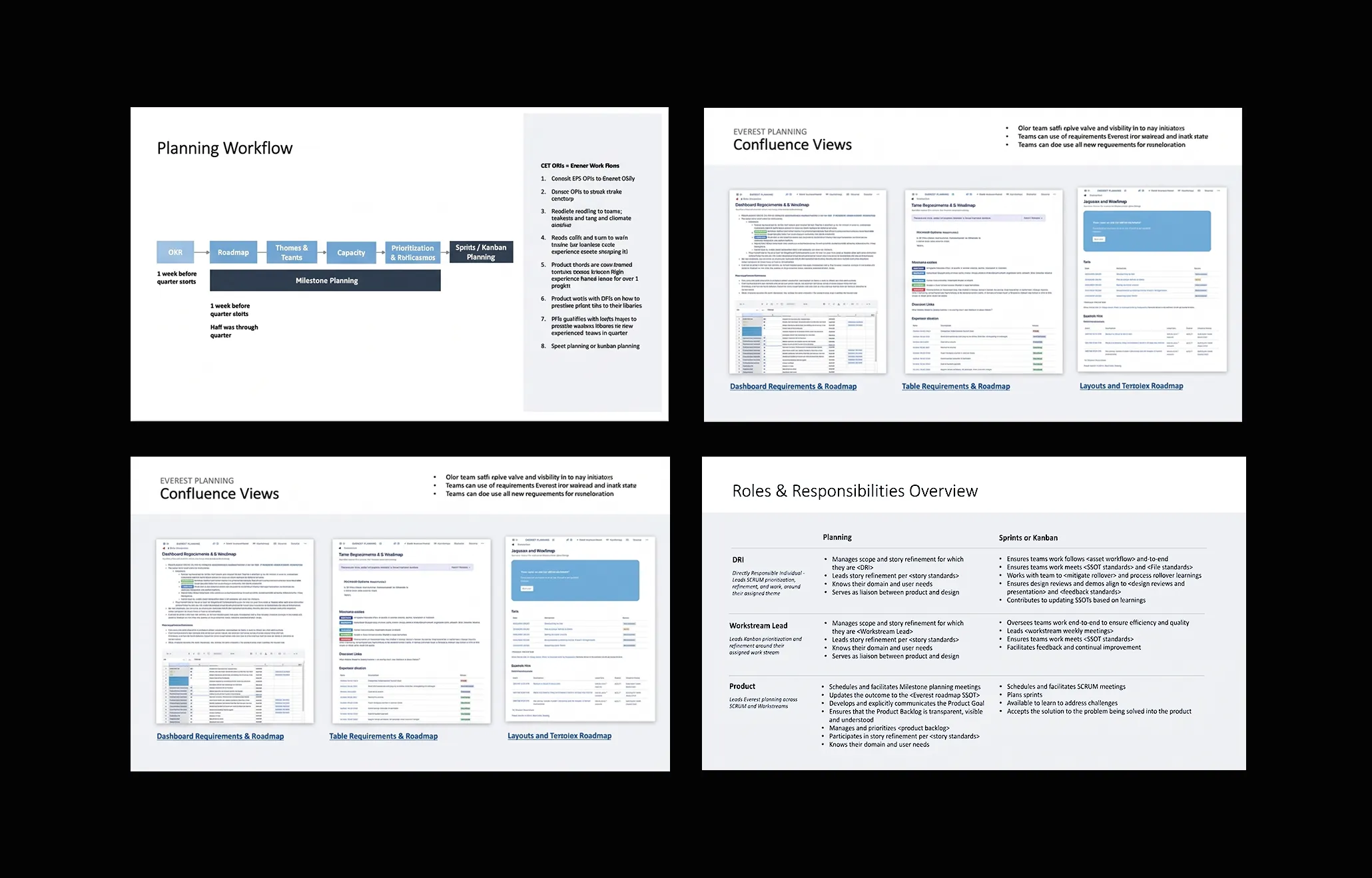
Enter experience layouts — a layer above components, composed of adaptive canonical layouts that define how screens are structured across web, iOS, and Android. Rather than leaving teams to assemble components from scratch each time, experience layouts prescribe the surface itself. Consistent across devices, familiar to users, and grounded in a simple truth: boring solutions aren’t a creative compromise — they’re a strategy.
In financial services, that bet is even clearer. Users managing money don’t want novelty. They want interactions that feel familiar, trustworthy, and easy to complete. Predictable UX is a feature, not a limitation.
If your system needs a meeting to function, it doesn’t scale
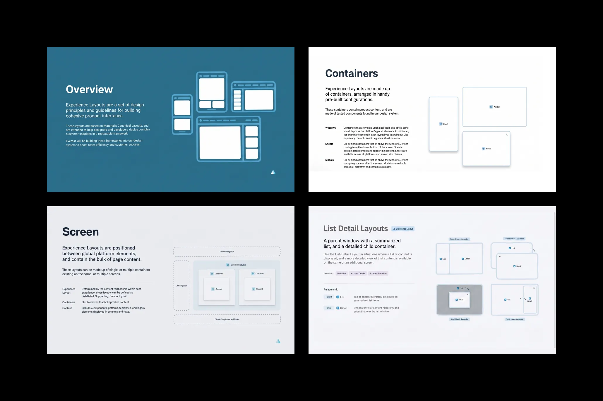
Taking a page from GitLab’s playbook, where operating at scale without co-location as a crutch meant one thing: write the decision down, make it findable, let the system outlast the people who built it. To scale, we needed stronger single sources of truth.
At GitLab — then the largest all-remote company in the world — if something wasn’t documented, it didn’t exist. That wasn’t bureaucracy. It was survival.
Applied to Everest, it meant clearer documentation, stronger guidance, and async-first practices that let teams access decisions without waiting for a sync. SSOTs became a way to reduce drag, not just store information.
Engineering often gets this quickly — it’s the same operating discipline behind well-run open source projects. Write it down. Make it reproducible. Don’t make the system depend on being in the room.
Clarifying ownership across overlapping systems
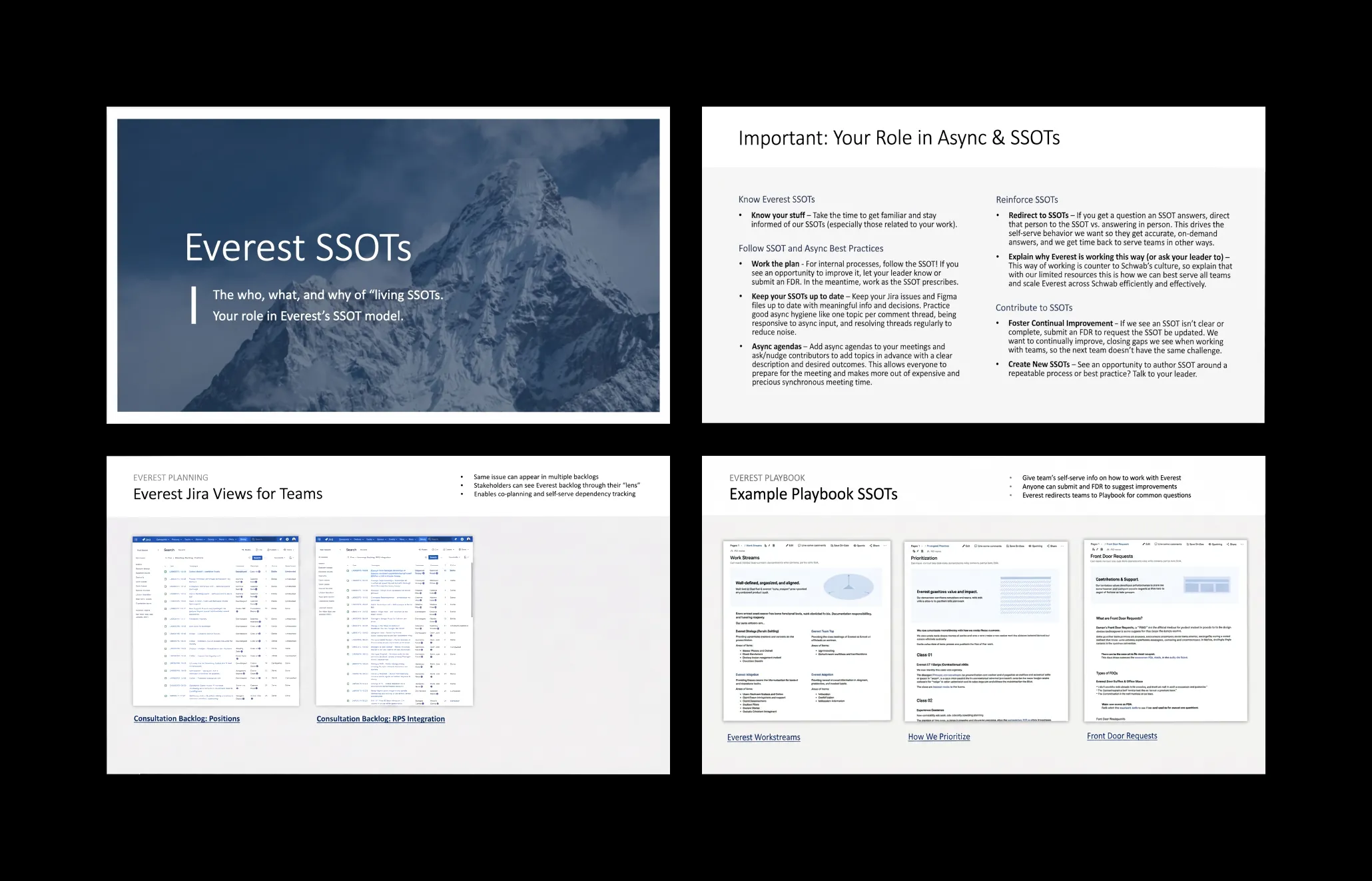
Large enterprises often have standards teams, UX content teams, and shared services teams — each trying to help product teams in different ways. Each built to serve its own org-chart logic. The opportunity was to clarify ownership, reduce overlap, and make it easier for product teams to find what they needed without reconciling competing sources on their own.
A familiar challenge. The goal was cleaner ownership boundaries, cleaner handoffs, and consolidation around how teams actually needed to consume guidance. Not fewer standards — better organized ones. Making the right answer easier to find than the workaround.
Building a system that listens
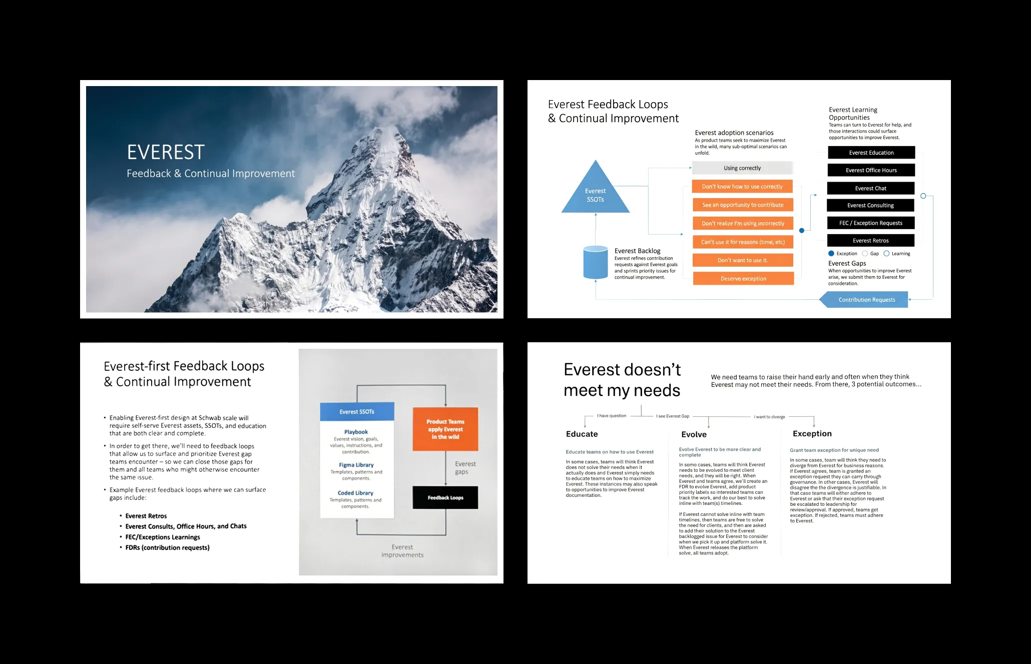
A design system only improves if the teams using it can help make it better. Our goal was a feedback loop that encouraged teams to raise their hand — through open consultations, team demos, Jira issues, and full access to our SSOTs. Every input routed to one of three outcomes: educate the team on how the system already solved their problem, evolve the system based on a genuine gap, or grant a documented exception when the business case justified it. Long term, the vision was scaffolding that supported direct design and development contributions. The idea was simple — they were closest to Schwab’s users, and the system got smarter when we listened.
Better UX economics through strategic reuse
This was ultimately about the economics of UX at scale.
With one central design system team supporting 30+ product teams, the only sustainable path was leverage. Every reusable layout, pattern, standard, and SSOT reduced the need for another meeting, another custom design cycle, another local interpretation of a decision that had already been made.
At the end of the day, it’s about spending less time solving solved problems and more time on the work that actually requires judgment. That’s where design creates real value — not in redesigning the data table for the fourth time, but in the decisions that shape the product’s direction and quality at scale.
A more consistent, scalable foundation
The work moved the organization closer to a model where UX scaled through systems instead of individual effort.
For product teams: clearer guidance, fewer duplicated decisions, faster paths to usable solutions across web, iOS, and Android — reaching millions of users across Schwab’s product ecosystem.
For users: more stable, predictable experiences in a domain where clarity matters. Managing finances isn’t a place where people want unnecessary novelty. They want interactions that feel familiar, trustworthy, and easy to complete.
This work wasn’t about making every experience look the same.
It was about building the systems, standards, and operating discipline that helped teams make better decisions faster. Reuse became the default. Custom work became intentional. And a small horizontal team created leverage that would have been impossible through direct support alone.
That’s what design systems are actually for.